

Clients wanted to customise everything. The product needed rules.
The Learning Lab is an LMS that global luxury, watch and fashion brands use to train their teams. Each client wanted the platform to look like its own brand, and developers customised it by hand. When I joined, the two apps, the code and the brand guidelines described different versions of one product. I audited the platform, ran workshops that separated the product from the brand, and built one design system that gives every client its brand without letting the interface turn into a monster.
TL;DR
- Problem: No design system. Two apps with two libraries, and every client's branding was manual dev work.
- What changed: The brief was a visual refresh. It became one design system for two apps and every client brand.
- Key decisions: Rules plus customisation over customising everything · Material's conventions over inventing our own · An icon library over custom icons
- Outcome: The learner app runs fully on the new system, the admin app is about 80% there, and clients set most of their branding in admin settings.


The situation
The Learning Lab sells its platform to global luxury, watch and fashion brands. When their people log in to learn, clients expect to see their own brand.
Before the redesign, developers met that expectation by hand. Icons came from different designers. The visual style changed whenever the CEO changed his mind. Nobody owned consistency.
My role
I worked with the CEO, the COO, who acted as product manager, and the CTO, who led development. A brand strategist joined me in the workshops and in key presentations. I owned the work from the heuristic review to designing the design system, the learner app and the admin app.
Process
Starting with what was actually broken
In January 2023, I started with a heuristic review. Four problems stood out.
Classes, courses, modules and lessons used nearly identical cards. Learners couldn't tell what they were about to open.
The top app bar had run out of room. New features kept arriving, and on smaller desktop screens the navigation broke.
Colour sent the wrong signal. Early progress showed in red, so a learner who had just started looked like they were failing.
Pages didn't look like one product. Layouts and components changed from screen to screen.


Then the brief turned out to be a question
The brief was a visual refresh. But nobody could say what the product should feel like. The leadership described it as young, fresh, modern and simple. "Apple, not Microsoft." When I asked for inspirations, the answers ranged from Canva to Jira.
In March 2023, I designed and ran two days of workshops with the CEO, COO, CTO and brand strategist. We placed the brand on scales from minimal to expressive and from corporate to start-up. We mapped The Learning Lab against LMS competitors and course platforms.
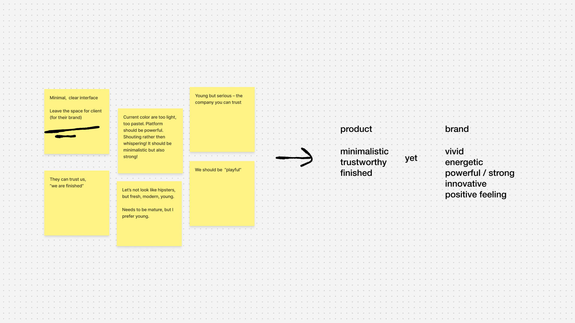
The key outcome wasn't a style. It was a split. We had been asking one thing to be both calm and loud. So we separated them: the product should be minimalistic, trustworthy and finished; the brand vivid, energetic, powerful and innovative.
That split shaped everything after it. The product could stay quiet, so client brands had room to speak. One sticky note from the workshop said it best: leave space for the client's brand.
Before building, I checked what already existed
With a direction agreed, I audited the existing styles before designing a single component. The learner app had drifted in every direction:
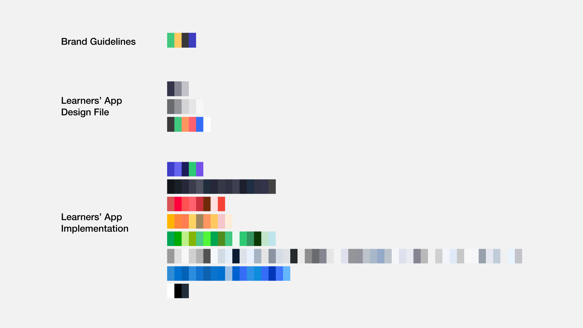
- Colour. 338 colour values. A quarter weren't linked to any style. The same white existed under eight names.
- Type. 177 text styles, a third unlinked. Two typefaces in one app: Poppins, used by the brand's website and marketing, and Basier Square.
- Icons. Three radically different icon styles, drawn by different designers.
- Buttons. ~20 button components, defined separately on three pages. None had states: no hover, pressed, focused or disabled.
The admin app had its own small library. It was better prepared, and its buttons had states. But it used a different palette, a fourth icon style and only Basier Square, which is how that font had spread into the learner app. Many elements also had low contrast.
Two apps of one product didn't look or behave like one product. The code, the designs and the brand guidelines each described a different version of it. The problem wasn't missing components. It was missing ownership.
In July 2023, I started building the system.
Customisation needed rules
The CEO wanted clients to customise almost everything in the interface. It sounded like the best service for luxury brands. I saw a product that would turn into a different, more broken app for every client.
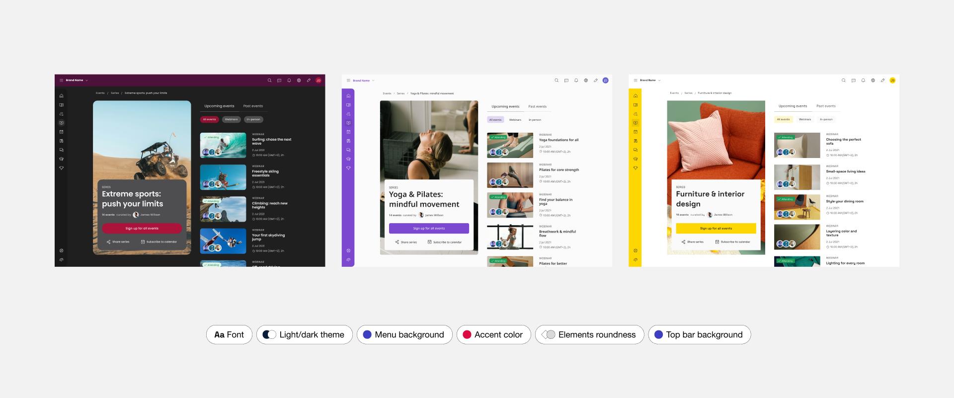
Convincing him took more than arguments. So the brand strategist and I designed the same view for three different brands, all built on the same rules. When the CEO saw it, he saw that it worked.
Clients now control their logo, colours, font, corner radius, header images, navigation pages and their order, and the data shown on content cards. Type weights, hierarchy and component behaviour stay locked.
The trade-off: some clients get less freedom than they ask for. In return, every client gets a product that still works.
The other decisions
Material's conventions over inventing our own
I didn't want to reinvent the wheel. I adopted Material Design's conventions for naming and for how components are structured and grouped. After an audit that found eight names for one white, a shared naming system was the first thing the product needed.
An icon library over custom icons
Across both apps, the product used four different icon styles. Drawing custom icons for every feature was costly and kept the mix growing. I convinced the team to move to Phosphor, a ready-made library. The trade-off: icons that are less unique to The Learning Lab.
Guardrails over trust
Low contrast was already a problem in the admin app. Letting clients pick any colour without a check would make it worse. I designed a contrast check into the branding settings: a WCAG warning appears when a colour pair fails. It's designed, not yet shipped.
Each decision moved a choice out of someone's taste and into the system.
The solution
One design system in Figma, built on variables, replaced two separate libraries. Today it drives both the learner app and the admin app. On top of it I redesigned the learner app (catalog, lessons and quizzes, events, leaderboard, profile, achievements, login and registration), added new features (a learner calendar, audio and video chats) and redesigned the admin app, including the branding settings.
Outcome
The learner app runs fully on the new UI. About 80% of the admin app has moved to it. Clients now set most of their branding in the admin app's settings [, without developers].
Shortly after the redesign, The Learning Lab signed many new clients in luxury and high fashion.