
Seerio – a brand ready for new markets
We designed a new visual brand identity for Seerio to build trust in the product, streamline communication and prepare the company for expansion into new MICE industry markets.
Project context
A client from the MICE industry (Meetings, Incentives, Conferences, Exhibitions) was developing a tool for analysing and managing event spaces in hotels. With a planned entry into new markets, they needed a credible and distinctive brand that would appeal to both existing and future clients.
As part of the collaboration with moonite.co, we advised the team on the rebranding process and designed a new visual identity for Seerio (logo for the new naming with a cohesive visual concept: font selection, colour palette, photography). At a later stage we also prepared the website design and supported the redesign of their digital product.
Key needs
- a refreshed image that would support positioning with new clients, while maintaining communication continuity with existing audiences.
- designing a visual system that supports a sense of professionalism and highlights values such as trust, transparency and collaboration.
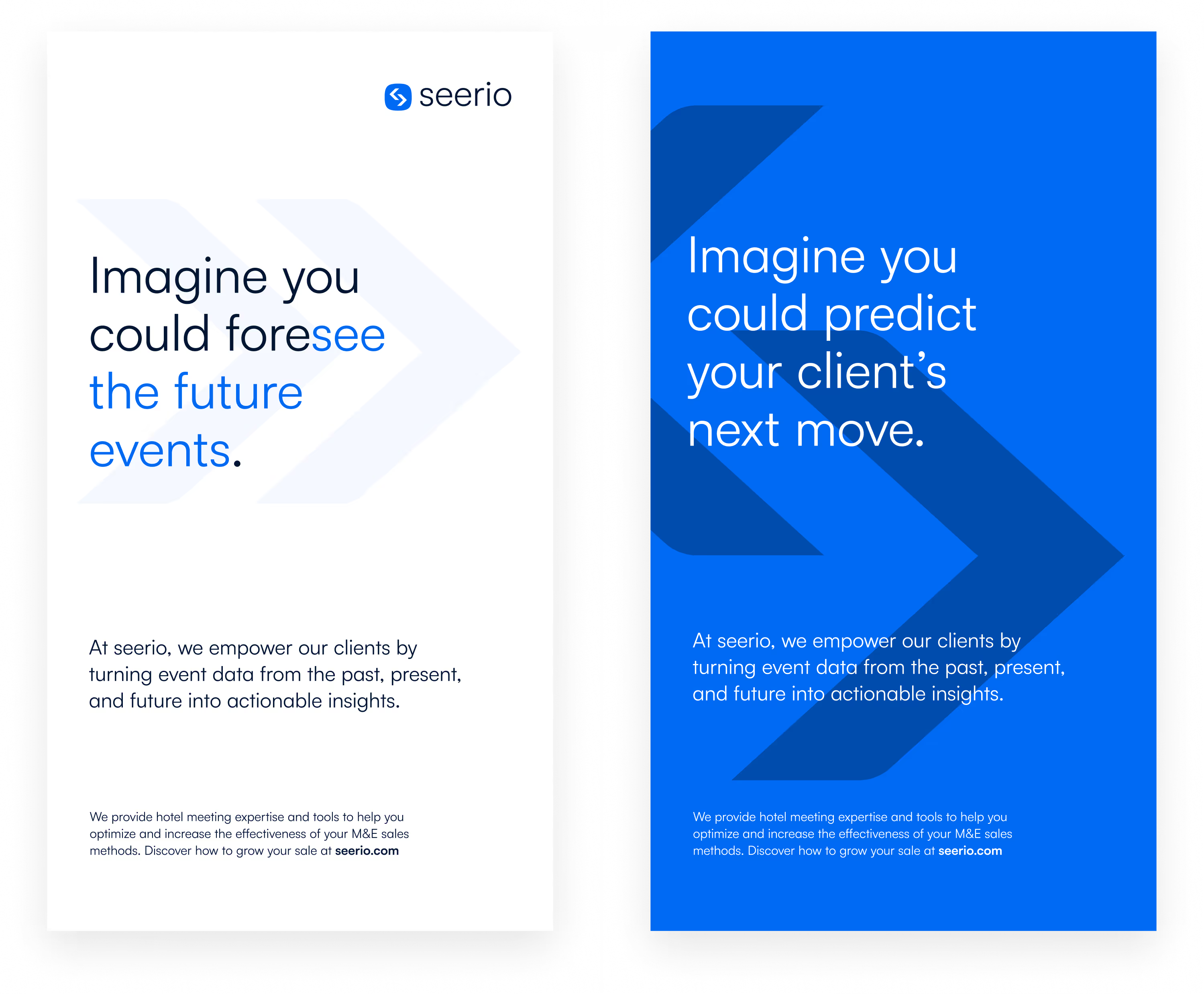
- a logo and graphic elements that would carry the idea: "see more = make better decisions".
Branding built on strategy
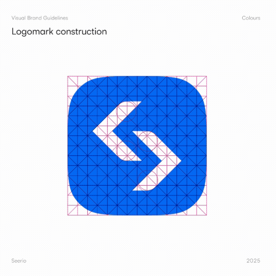
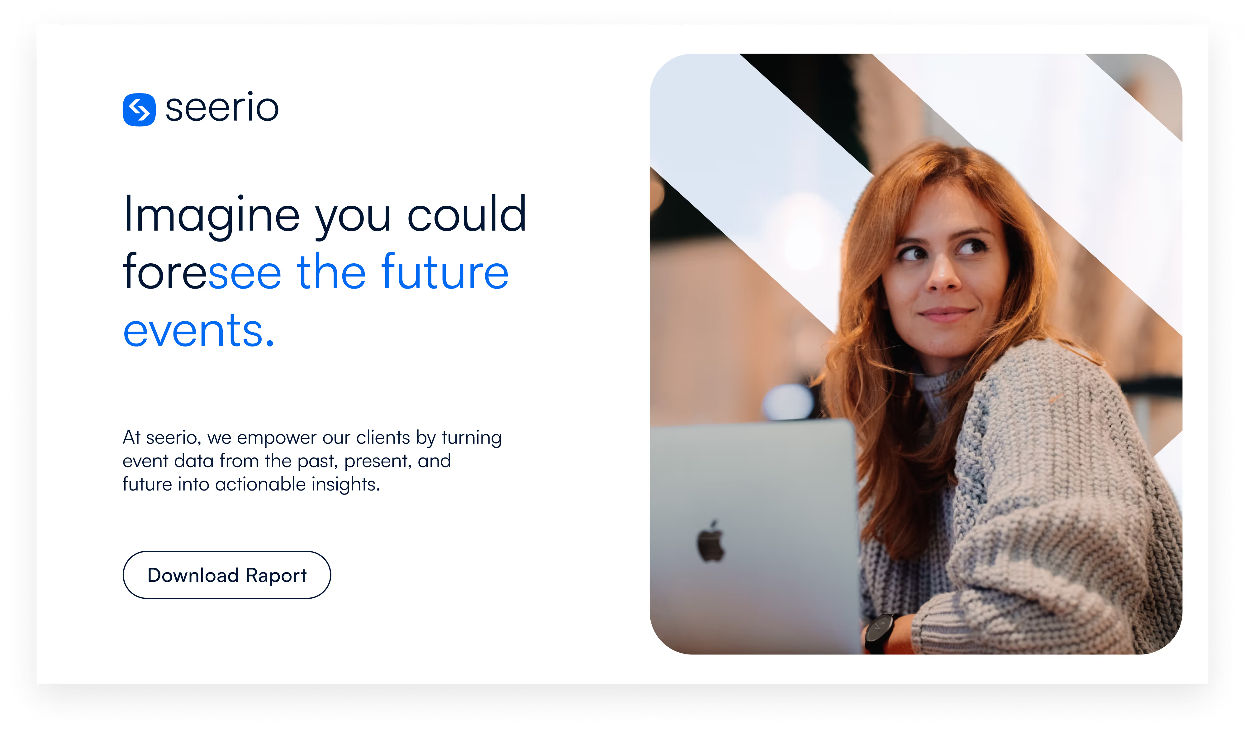
The visual concept references the new brand name — Seerio, inspired by the English word seer (a person who sees or predicts the future). This is a direct reference to the core function of the application, which enables the analysis of past data and forecasting of client behaviour trends to support better business decisions in the events and meetings industry.
The designed mark combines the letter "S" (the brand's initial) with two arrows visible in the negative space, pointing left and right — symbolising the past and the future, depending on the point of view. The symbol enclosed in a rounded shape aids app recognition on mobile devices, while also referencing the colour palette of the previous product (Demand Outlook by Z—Factor), which was important for existing clients.

A look that builds trust
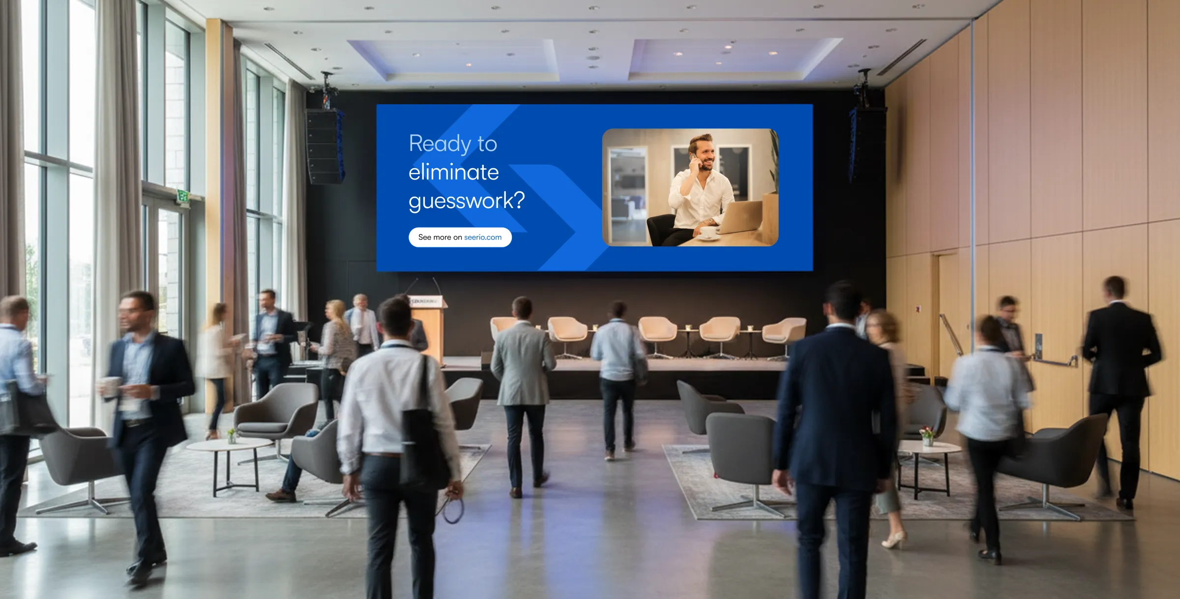
We also used the arrow motif in visual materials and the narrative layer — including the presentation of photography and multimedia. These show clients who, thanks to Seerio's support, feel more confident and work more effectively. Depending on the context, the arrow symbolism can indicate browsing past events, forecasting trends or comparing data.
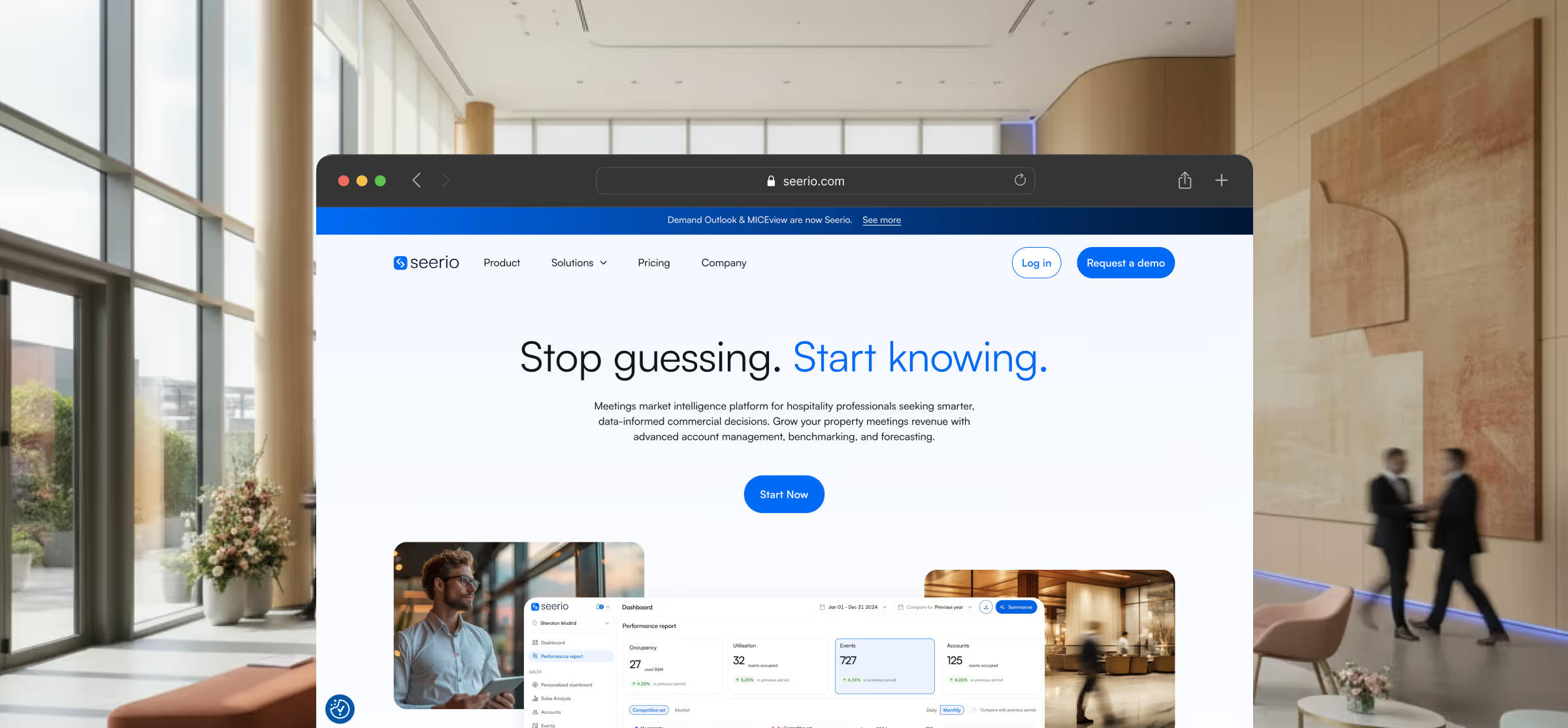
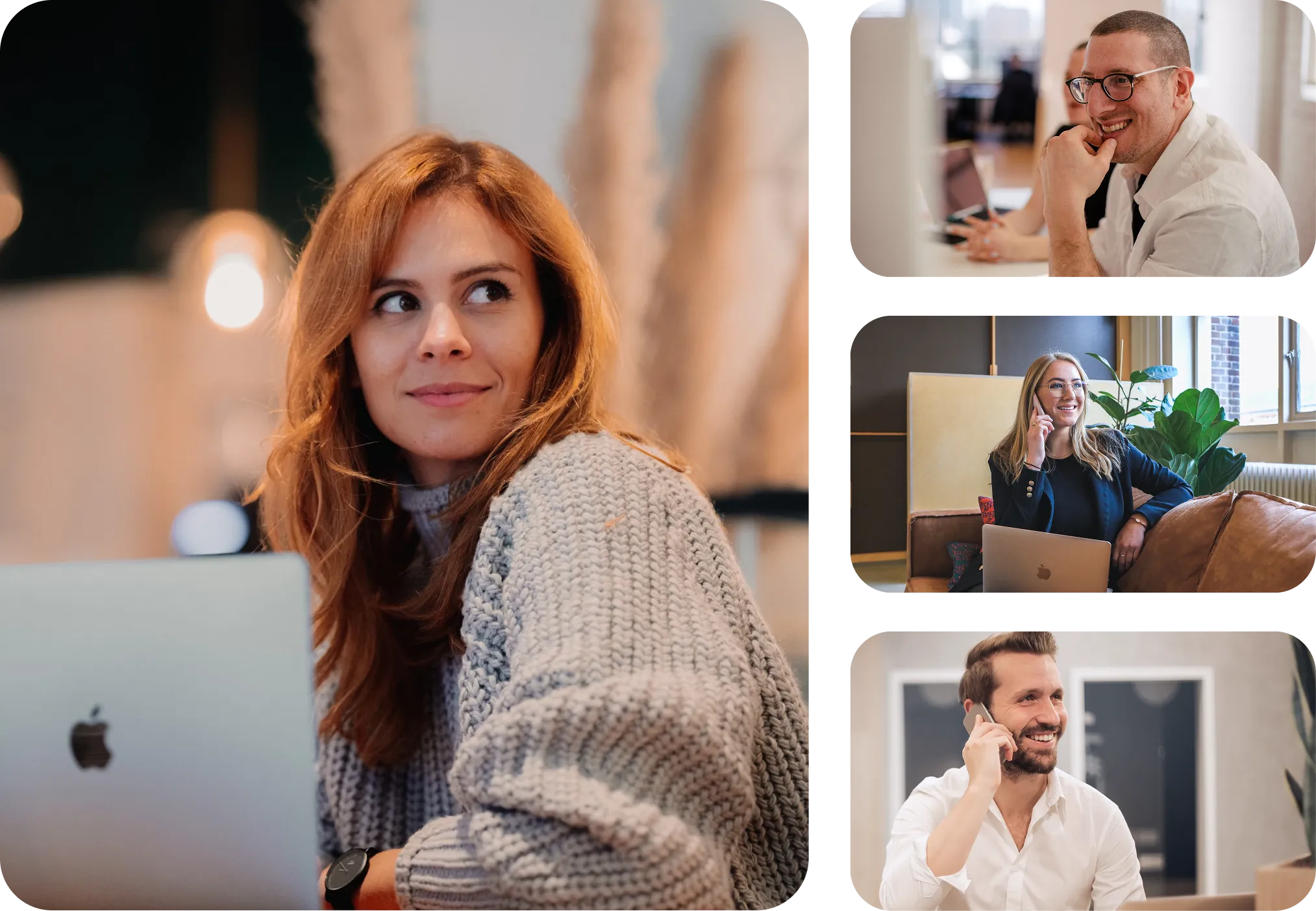
With a data-sharing product in mind, our goal was to build a brand that inspires trust and supports transparent collaboration. To reinforce a sense of modernity and credibility, we used a clean layout with plenty of breathing room (negative space), clear typography (the geometric yet human Satoshi typeface) and a contrasting colour palette with a strong Seerio Blue accent. The photography and video style emphasises the positive impact of the product on user effectiveness — focusing on their satisfaction rather than the tool itself.
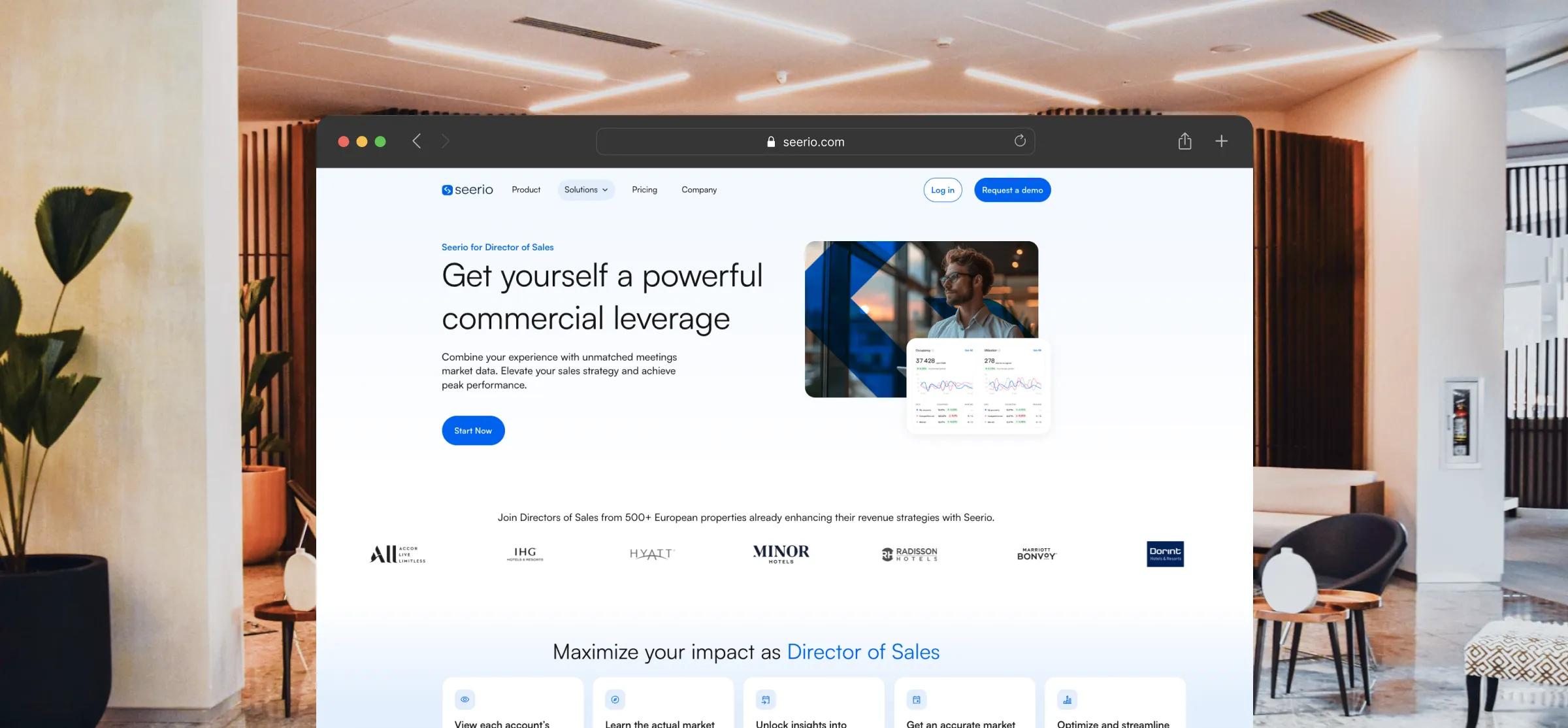
As part of the overall collaboration, we also designed a SaaS-oriented website that clearly communicates Seerio's offer, builds brand awareness and supports sales efforts. We also carried out UX/UI work on the application itself.
Project results
The new visual identity allowed the Seerio brand to:
- step out from the shadow of a tool-focused product and take a stronger market position,
- maintain communication continuity with existing clients,
- and support the product's expansion into new markets and target groups,
The client's team received not just a logo, but a complete visual language that grows alongside the product.
Stand out from the crowd!
Your brand finally deserves the right setting. Book a free 30-minute meeting and see how we can help you stand out.